On Wednesday we were handed the Creative Brief for Global Proofreading & Copy-Editing – a new logo and branding to go with their new website launch.
A Proofreading company isn’t the easiest starting point for original logo design, especially considering the client wanted a ‘fun and quirky feel’ to the design. But here’s how the design process begun…
Which then got refined into this…
And finally a bit of text…
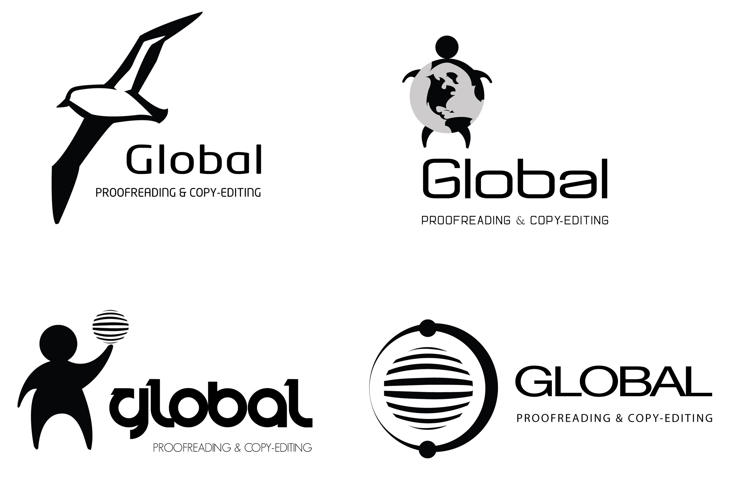
Four main ideas:
- Spinning globe (stripes used to signify its spinning) with a man to give it a bit of personality
- Albatross (because they fly around the globe – global travelers? There’s a link there…)
- Corporate looking Globe. A bit dull, but a safer option.
Feedback from Mark (the UE Senior Designer) was that the Albatross was the strongest symbolically, but the link between it and the globe needed to be clearer.
A bit of colour exploration….
And we have a final brand…


