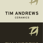
Tim Andrews is a ceramic Artist in Devon, who previously had a non-existant visual brand identity. He produces premium level ceramics, and required a logo and visual identity that emphasises this.
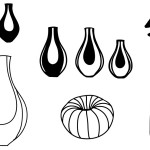
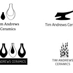
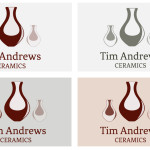
The first round of logo development was very much a stab in the dark, as very little was provided by the client in terms of a brief, therefore the four different concepts that were put forward were created using his most recent work as source material.
I wanted to emphasise the hand made nature of Tim’s work through using a hand-made aesthetic in his branding. These rapid experiments were produced on Photoshop.
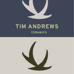
After propsing the four different solutions to the client, his feedback was that he wanted something more abstract, and less specific to his current work as this was constantly changing in shape, style and size. Therefore it was back to the drawing board to create three completely new, abstract concepts.
