It’s hard not to be swept up in all the excitement of the US Elections – a far cry from the Cameron / Milliband squabbles of last summer – the US elections have packed out stadiums, cheerleaders, and an awful lot of merchandise. Just as a point of interest I’ve had a go at comparing the websites of the current four front-runners to see what their websites can tell us about the candidates. Admittedly every time I go to publish this post the front-runners for the Republicans change, so I’ve drawn a line under it and gone with Ted Cruz and Donald Trump for the Republicans, and Hillary Clinton and Bernie Sanders for the Democrats.
The websites were first checked on mobile (because if ain’t mobile first it sure as hell ain’t America first) then moved on to desktop, so my observations are from both. From the outset I have to say loading four separate websites that don’t bombard you with the dreaded Cookie Notification is nothing but a breath of fresh air. Clearly Americans aren’t as terrified of cookies as we are.
First Impressions
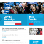
In a not so subtle attempt to show his campaign is for all americans, Bernie has tried to include a photo of all Americans above the fold – it’s a lot to take in, especially at full screen, and the resulting effect is of a memorial website. Not quite the uplifting desired message.
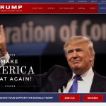
Interestingly / unsurprisingly Donald was the only one of the four candidates to show a prominent photo of himself above the fold (and an enormous photo at that). As a showman this is understandable – with Trump you’re not voting for policies or a politician – you’re voting for a celebrity, so better make his glorious face front and foremost.
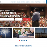
Ted, Hillary and Bernie all have extremely prominent calls to action of joining their respective movements pretty much shouting at you on the homepage, although Donald also has this call to action, it’s essentially overshadowed by his enormous face.
Money money money
On the Clinton page Hillary makes her agenda known from the off-set – she wants yer money. Pre-selected donation amounts entice the user into donating small amounts from the homepage. Despite claiming a net wealth of $10 billion, Donald also has a Donate call to action on the homepage, although his Donate button again is somewhat overshadowed by his own face.
However despite being all about money on the homepage, when you reach the pretty-much identical donation pages of the three candidates, you’ll find that Hillary is asking for far less than the other three (Hillary’s suggested donation range is just from $3 to $250, Bernie comes in second $10 – $1,000, Trump’s is $10 – $2,700, and despite pretty-much hiding his donation page Cruz is actually after the most, with a suggested range of $25 – $5,400). However none will let you pay with Paypal, so that was me out.
Besides promoting the candidates, the websites are the candidate’s opportunity to layout their policies on issues, so you know what they’re all about. Trump has 5 issue’s he summarises for you in short paragraphs (there is the option to read more on each issue, but I don’t think he really wants you to). Ted has 9 issues with beautiful images to summarize the content and entice you in, Bernie has 22, but Hillary brings home the bacon with no shorter than 27 separate issues, all with extensive supporting pages with mixed-media content. She’s going in heavy with the issues, and there’s a lot to read about.
Brand-idates
I don’t want to get too caught up in branding as I feel that’s another much broader topic entirely, but the logos are worth a quick review.
You have to hand it to Hillary – using a logo that works as well as a favicon as it does on A3 printed boards deserves a nod – a lot of ageing Graphic Design tutors will be very pleased, the rest of the design community won’t be quite so impressed with an arrow stuck on an H.
Trumps bold, wide logo feels very intimidating in the top left hand corner, I’m not sure if it’s the dodgy gradient but it feels like it’s towering over me – a bit like the Ministries towering over Winston Smith in 1984. No friendly, approachable flat design here logo, it shouts corporate domination to the masses.
Bernie’s however is the complete opposite, the slightly chubby, quirky looking font makes the logo look almost adorable – like if you tickle it it would chuckle. Change the letters slightly and this very easily could be the logo for Barney the purple dinosaurs electorate campaign.
Ted’s is very reminiscent of the 2008 Obama campaign logo, a simple, versatile icon that plays it safe whilst still looking nice enough.
Stash
Politicians merchandise is something completely alien to us Brits – the idea of a David Cameron hoodie or phone-case would fuel such a storm of mockery, Twitter would probably break. The Americans however, love it. All three of the candidates have an online shop where you can buy branded items ranging from drinks coolers to hunting caps.
Hillary is the outright winner for me in terms of merchandise, with the incredible ‘Grillary Clinton BBQ Spatula’, closely followed by the ‘Girls just wanna have fun-damental rights’ tote bag. I’m not sure if Bernie realises the sexual innuendo on his ‘Feel the Bern’ mug, I like to think he doesn’t but I think I’d admire him more if he did. Dirty old boy.
However it appears Cruz’s website shop has received unprecedented (or un-presidented should I say) high demand, as a notification at the top lets you know some items may take 2 to 3 weeks to deliver. Managing expectations from the outset, you can’t fault the guy.
Social
One final note would have to be the social media presence of the three. Hillary has spread her wings far and wide in the social spectrum, even having a relatively active Pinterest account filled with ‘Granddaughter gift ideas and hair style inspiration’, (again just imagine the onslaught if Twitter discovered Cameron had a Pinterest board of hair inspiration).
Ted however walks home with this one, as the only candidate to have his own app. Ted Cruz 2016 is available on both Android and iOS devices and has received a 5 star rating on the App Store. It’s designed to engage voters into the campaign in only a mildly condescending way (you can earn points and win badges!), and appears to be very successful – as the first electorate app available it will be interesting to monitor its effect. But again, that’s a whole other conversation.
So to round up:
- Hillary wants yer money (but not loads of it), and has the best stash
- Ted wants all yer money (but is keeping it on the down-low), and will tell you if something’s gonna take a while
- Bernie’s either a bit naive or an absolute lad
- Trump loves his face
That’s all folks, I’m off to fire up the BBQ and use my new Grillary Clinton spatula.


